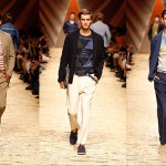


EMERGING DESIGNER: 7 QUESTIONS WITH AUSTON BJORKMAN, SIR NEW YORK

Things are happening for up and coming New York based designer Auston Bjorkman and his line of fashion forward menswear—SIR New York. After cutting his chops with the likes of Thom Browne and Loden Dager, this FIT graduate has gone out on his own with a brand that manages a men’s style holy grail of sort—to meld innovation with wearability. Fall 2012 will be Bjorkman’s 4th collection for SIR New York but before you can get your hands on that, this Wednesday (August 1st), Idontlikemondays.com will premier a collaborative SIR tank top as part of their GALLERY project. We caught up with the busy man to find out a little more about his budding brand, design philosophy and and his fondness for using the Braille language. Read on…
Essential Homme: What’s the inspiration behind this collection?
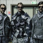
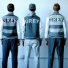
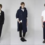
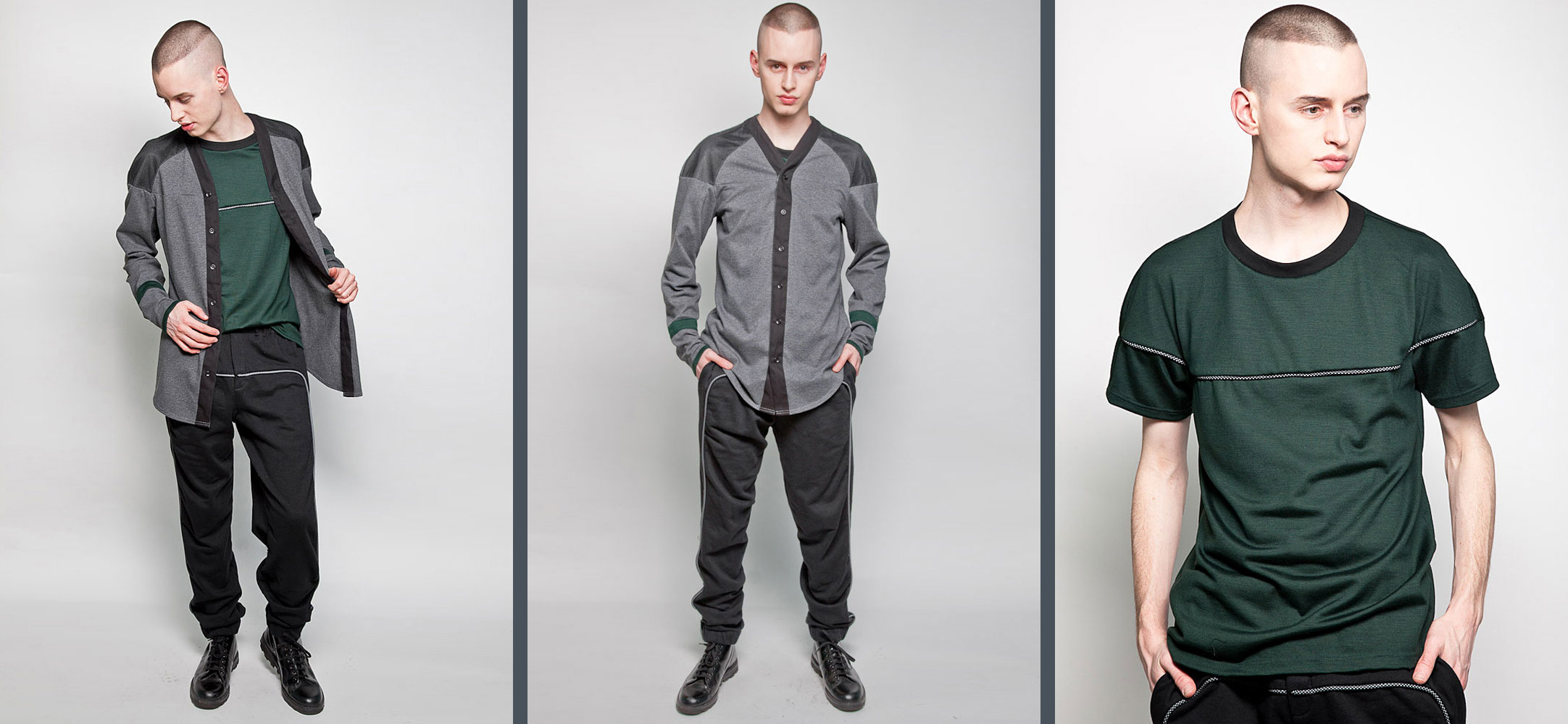
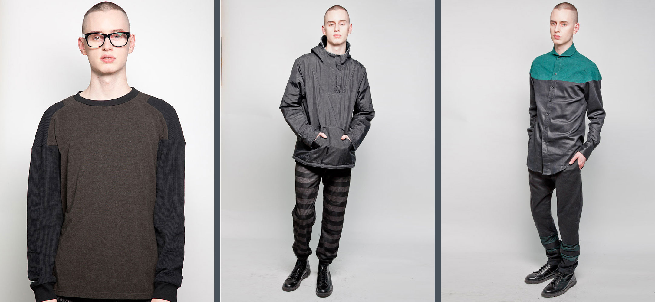
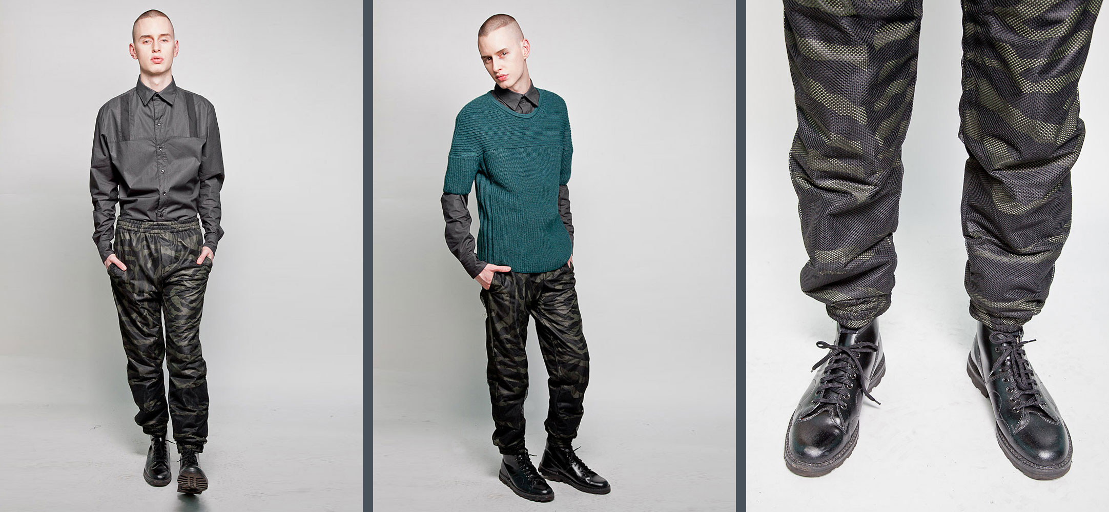
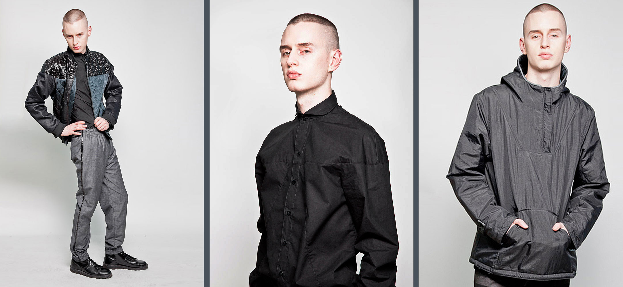
Auston Bjorkman: I was inspired by the lines of both hockey uniforms and what a hockey player would want to wear after a game and horse racing jockey silks. I try never to make my inspirations literal, it always gets translated into a Sir New York aesthetic. For example, most of the pants this season have bold stripes on the lower legs but have an overlay of mesh that adds texture to a garment which is usually very straight forward. The shirts have really cool geometric lines inspired by jockey silks but are monochromatic unlike the bold bright silks.
EH: What fabrications/materials did you work with?
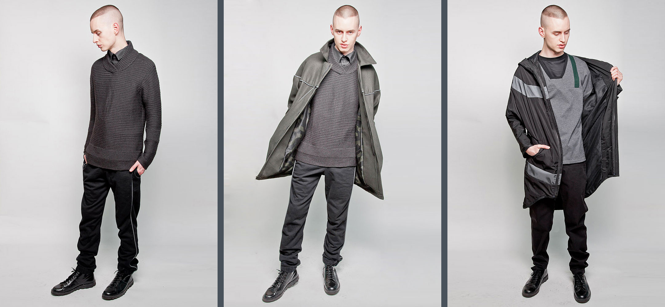
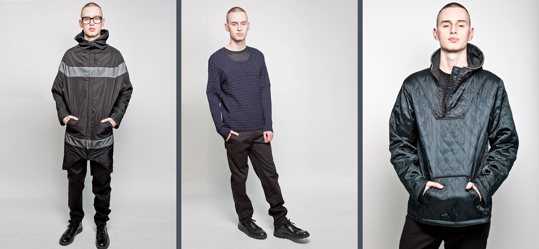
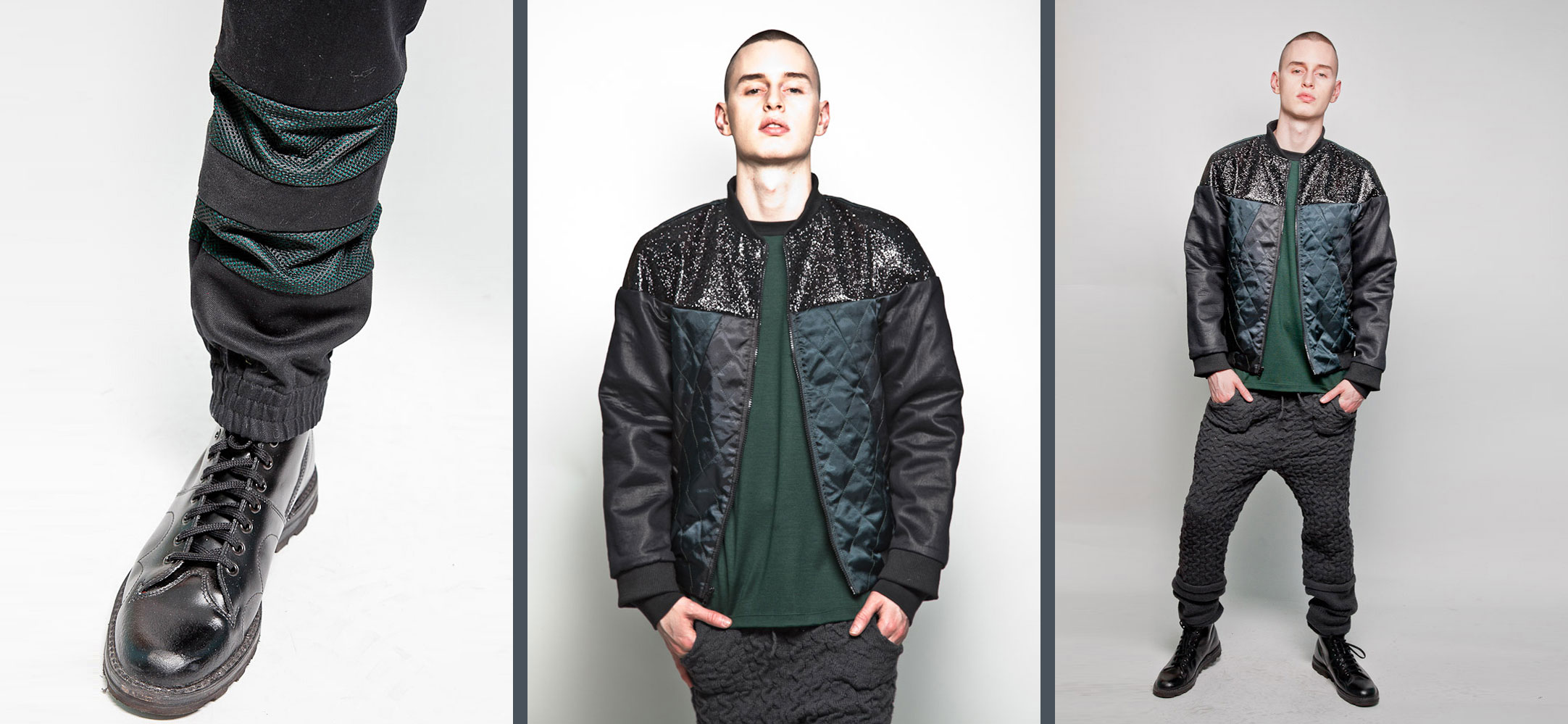
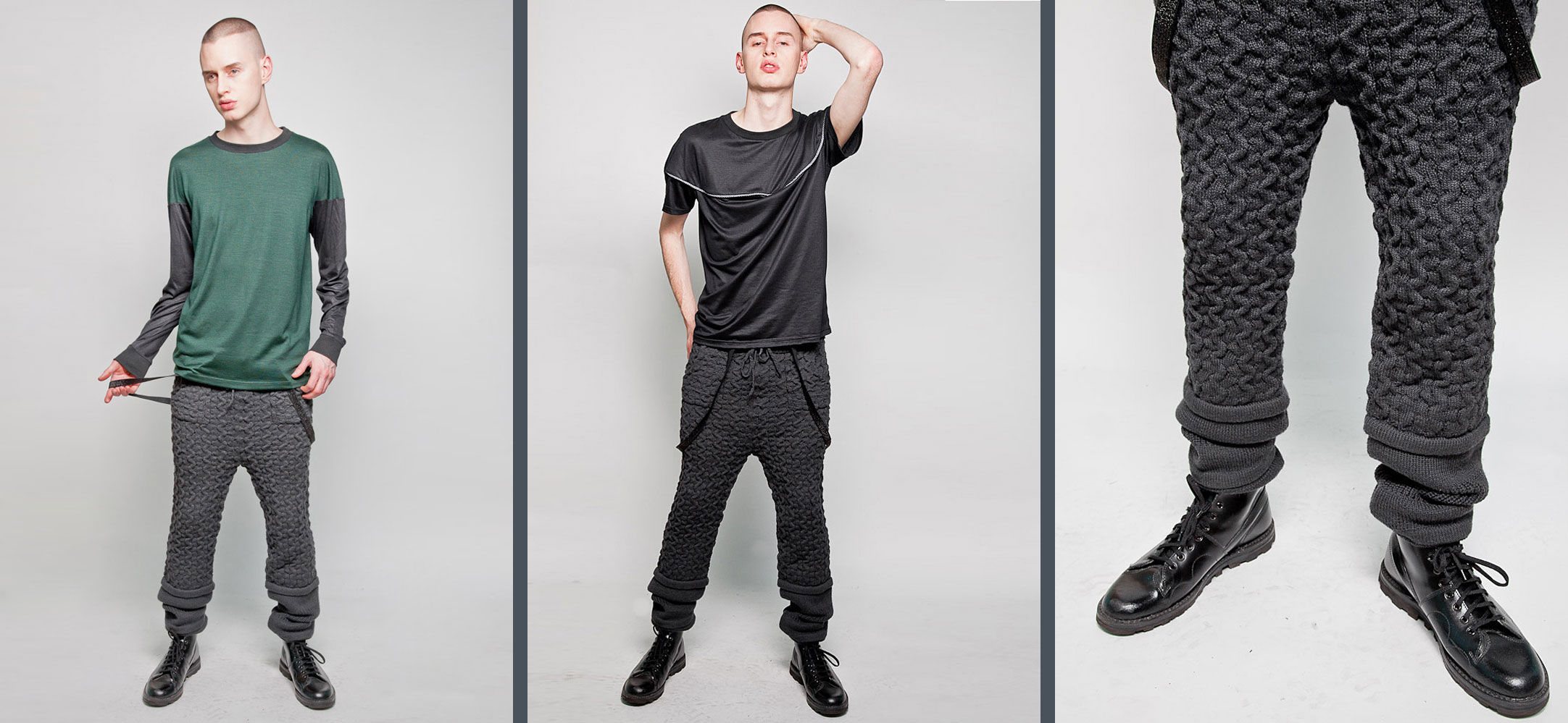
AB: I always combine technical fabrics with natural knits and wovens. This season features reflective fabric with an overlay of mesh. I love the way it tones down the brightness and gives it a 3 dimensional quality. All the fully fashioned knits, the sweaters and the pants are 100% Alpaca made in Peru, everything else is made in NYC. There are really cool rubberized nylons, waffle knit thermals, sparkle nylon/spandex—in the bomber jacket and on the tuxedo trousers—quilted outerwear, and cotton piques used in a button down and pullover that features a square neck, I wanted to use it in a non traditional way, something other than the normal polo shirt.
EH: Name one famous person you think this collection would be perfect on.
AB: Lil wayne.
EH: Are there any pieces that have cool tricks/functions you can’t tell just by looking?
AB: I mentioned the reflective fabric which you really cant tell is reflective at first, the mesh really helps to keep it incognito. Some of the outerwear is reversible. The sparkle jacket is extremely fun and the fabric is unlike anything I have ever used before it almost looks like glitter but it is the fabric itself. There are also mesh overlays that play with optical illusion, dimensionality and texture. And as with every collection there are fun secret pocket details, like stripes or pops of hidden color.
EH: You’re a young designer, up and coming, what’s the biggest challenge you face when designing a collection? What’s your style philosphy?
AB: The designing is the easy fun part for me as a creative visual person. The challenge is the business side. Which in the end is 90% of having your own line. The philosophy behind Sir is “athleticism with a hint of provocation”. It’s always important to me that the fabric feels good, the garment fits well and has a hint of playfulness. Be adventurous, take risks and have fun.
EH: How did the project with I Don’t Like Monday’s get off the ground?
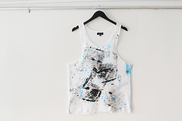
AB: This project started by my desire to collaborate with my artist friend Dove Drury Hornbuckle. I wanted to do a Sir New York take on graphic T’s and he was experimenting with silkscreens so we pitched the idea to the guys over at I Don’t Like Monday’s and they were instantly on board.

I Don’t Like Monday’s Gallery
EH: The conceptual tanks are inspired by your use of Braille in the SIR New York Logo. How did you translate the graphic Braille language onto the tank tops? Was this the first time you incorporated your Braille logo directly into the design of a garment?
AB: Yes this is the first time that I incorporated the Braille logo. It is such a beautiful visual and textural language which is exactly what Sir New York is all about. I wanted to play with the logo without it being a blatant translation. So we played with repeats, placement, and obscuring the logo, then added Dove’s painterly effects. Some of them we also use a mesh overlay to give them another texture and 3 dimensionality and others we let stand as they are. We didn’t want any of them to be “perfect” because they are each one of a kind and really are “paintings” so to speak. We play with this same idea again but in a totally different way in the Spring / Summer 13 collection in another collaboration with my good friend and illustrator Ross Schaner. There are so many possibilities with the three simple letters SIR in braille. You see more variations on this throughout the seasons.