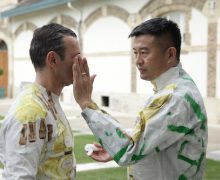
Fashion Artist Liu Bolin x Ruinart Champagne at Frieze By Angelika Pokovba on May 4, 2018 https://www.youtube.com/watch?v=wjQKx-H1Dic Known as The Invisible Man, Chinese artist... Read more →
Fashion 5 For Chinese Menswear Brand Bosideng, Subtlety is a Drink Best Served Blended By Joshua Glass on February 14, 2014 In August of this past year, the narrative rights of author Kevin Kwan's debut novel,... Read more →
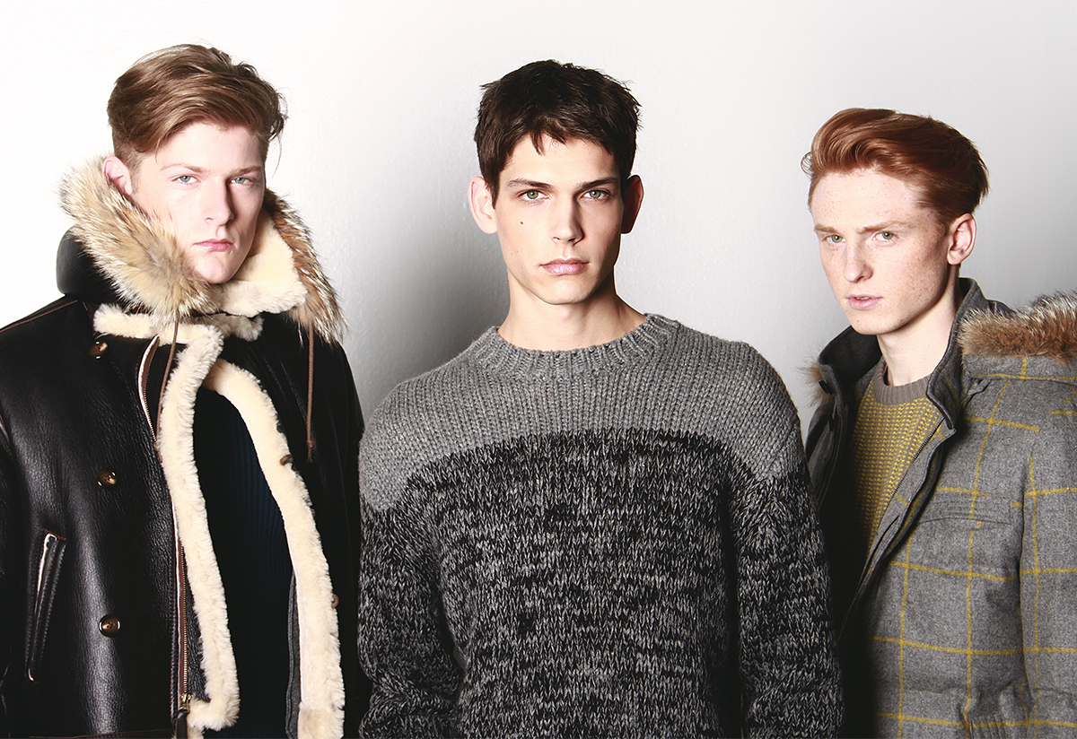
Fashion 7 The Inspiration Behind New York Men’s Day By Joshua Glass on February 3, 2014 Listen up men of New York: in case you haven't heard, we've finally been given a day for... Read more →