


From Type to Timepiece, Mondaine Uses Helvetica Font as Muse
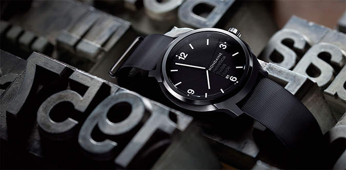 Image: Mondaine.
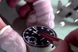
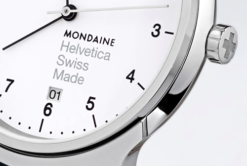
Swiss watch brand Mondaine has used one of the world’s most iconic fonts, Helvetica, as its muse for its latest family line of watches. Developed in 1957 by typeface designer Max Miedinger, Helvetica has become ubiquitous for its usage in public transportation systems—including the New York City subway and Chicago L—as well as in familiar logos such as BMW, American Apparel, and Microsoft.
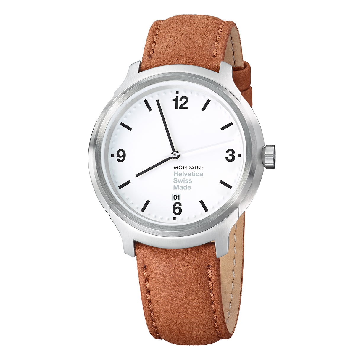 Image: Mondaine.
Keeping the essence of the type design perfectly intact, Mondaine designers have created beautifully minimal timepieces with the brand’s straightforwardness along with a few surprising details. Acknowledging the font’s design, the Helvetica numeral “1”—with its famous curved crossbar—was cleverly inserted as the watch lugs. The date aperture is also slightly off its traditionally central axis position to fit in with the left-aligned typography on the dial.
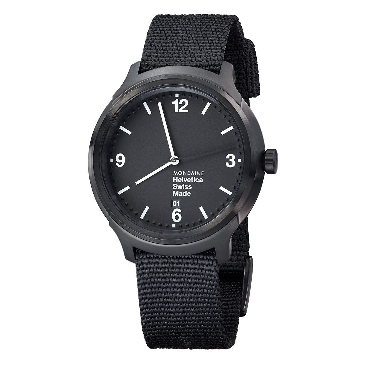 Image: Mondaine.
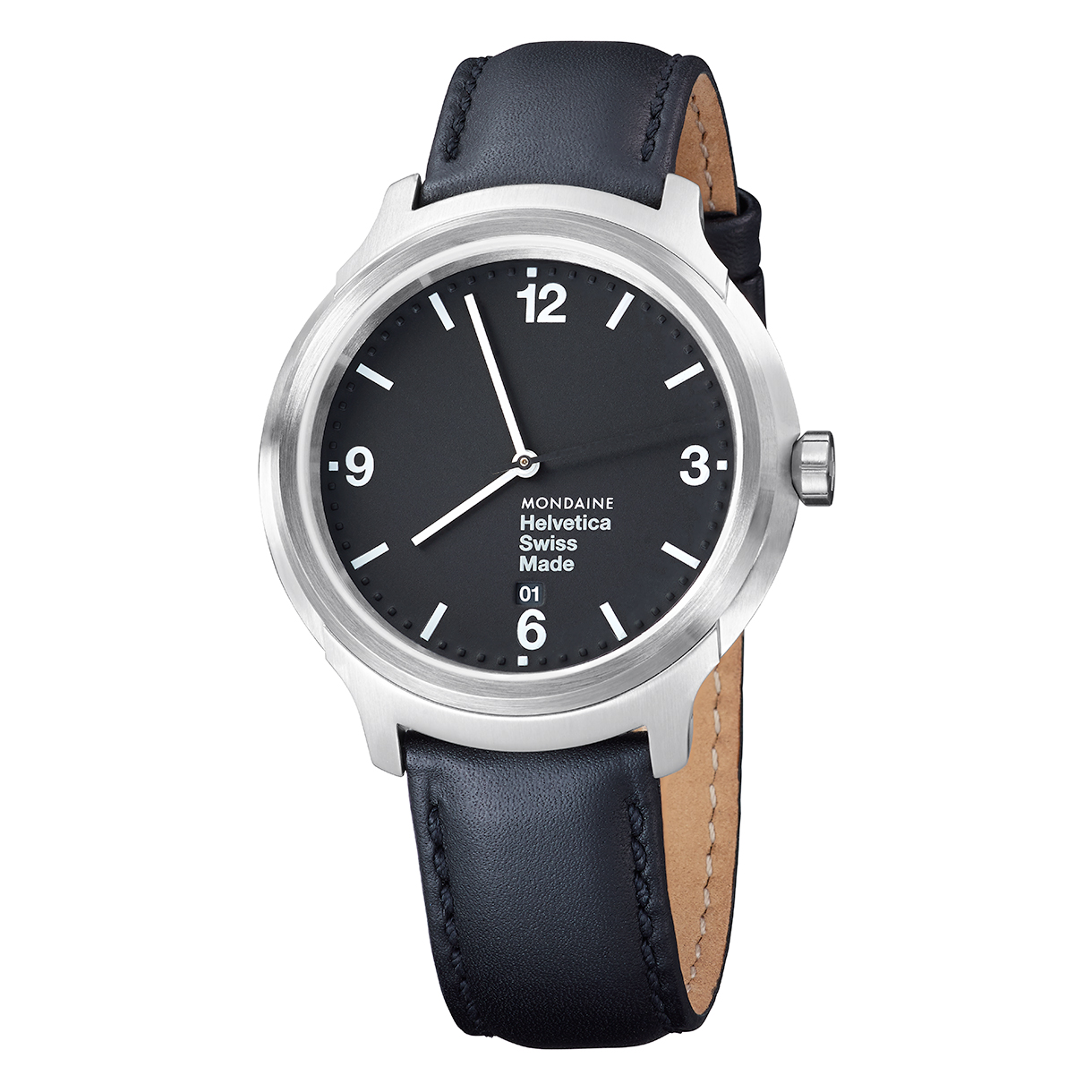 Image: Mondaine.
Just like Helvetica, Mondaine’s new watches are discreet, yet strong in the conviction of providing efficient time keeping in a recognizable form and will surely stand the test of time.
The Mondaine Helvetica line has three styles with names based on the typeface (Light, Regular, and Bold), and is available online now.